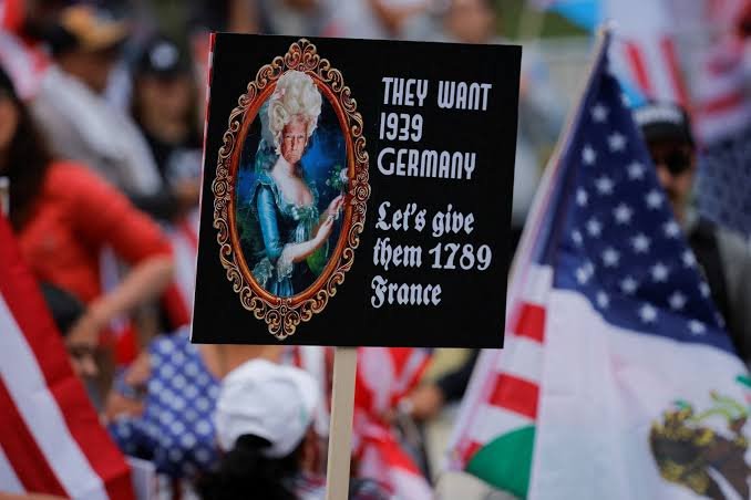
No kings poster ideas are most effective when they combine a short, memorable message with bold typography and clear visual contrast. Whether you’re designing a protest sign, educational poster, community display, or civic awareness graphic, the strongest designs communicate their message in just a few seconds while remaining respectful, readable, and visually striking.
Why “No Kings” Posters Continue to Capture Attention
Throughout history, people have used posters to express opinions, encourage civic participation, and communicate shared values. A No Kings poster generally represents support for democratic principles, equal rights, accountability, and the belief that no individual should hold unchecked authority.
A successful poster isn’t simply attractive.
It communicates instantly.
People walking or driving by often have only two or three seconds to read a sign, making simplicity one of the biggest design advantages.
Quick Reference Table
| Feature | Details |
|---|---|
| Primary Purpose | Civic expression and public awareness |
| Common Style | Bold typography with minimal graphics |
| Best Font Size | Large enough to read from 20–30 feet |
| Color Palette | Black, white, red, navy, gold accents |
| Design Focus | High contrast and readability |
| Popular Formats | Printable PDF, digital graphic, handmade poster |
| Audience | Community events, marches, classrooms, educational displays |
| Visual Style | Minimalist, vintage, modern, illustrated |
| Average Reading Time | Under 5 seconds |
| Recommended Resolution | 300 DPI for printing |
What Makes Great No Kings Poster Ideas?
The strongest No kings poster ideas all share a few characteristics.
They communicate one message.
They avoid clutter.
They remain readable from a distance.
Professional designers often recommend using only one main slogan paired with one supporting visual instead of trying to include multiple ideas on a single page.
The result feels cleaner and far more memorable.
Essential Elements Every Poster Should Include
A successful poster generally combines several design principles.
1. Large Headline
The headline should dominate the layout.
Examples include:
- No Kings
- Power Belongs to the People
- Democracy First
- Equal Voices Matter
2. Strong Contrast
Black text on white.
White text on navy.
Red accents against neutral backgrounds.
High contrast dramatically improves readability.
3. Plenty of White Space
Crowded posters become difficult to read.
Empty space actually strengthens visual impact.
Best Color Schemes
Color influences emotional response.
Here are combinations that consistently perform well.
| Color Combination | Best Use |
|---|---|
| Black + White | Classic, timeless |
| Navy + White | Professional appearance |
| Red + White | High visibility |
| Black + Gold | Historic style |
| Gray + Black | Minimalist themes |
| White + Dark Blue | Community events |
Avoid using too many bright colors together.
Simple palettes usually look stronger.
Minimalist No Kings Poster Ideas
Minimalism continues to dominate modern poster design.
Some examples include:
- Large words centered on a white background
- One symbolic crown with a diagonal line through it
- A single raised hand illustration
- Clean geometric layouts
- Black typography with one red highlight
Minimal designs are easier to recognize from a distance.
Vintage-Inspired Poster Concepts
Vintage artwork gives posters a timeless quality.
Design elements may include:
- Distressed textures
- Traditional serif fonts
- Limited color palettes
- Historical illustration styles
- Classic print layouts
These posters often resemble early civic campaign materials while remaining visually fresh.
Modern Graphic Design Styles
Many designers prefer a contemporary approach.
Popular techniques include:
- Flat illustrations
- Bold geometric shapes
- Sans-serif typography
- Simple iconography
- Grid-based layouts
- Large empty margins
Modern posters often perform exceptionally well online because they scale nicely for social media.
Typography Tips That Improve Readability
Typography determines whether someone actually reads the poster.
Choose fonts carefully.
Good options include:
- Helvetica
- Inter
- Montserrat
- Bebas Neue
- League Spartan
- Franklin Gothic
Avoid decorative fonts that reduce legibility.
The headline should always be the largest element.
Symbol Ideas That Strengthen the Message
Visual symbols communicate quickly.
Popular examples include:
- Broken crown
- Ballot box
- Raised hand
- Liberty torch
- Scales of justice
- Stars
- Constitutional imagery
- Olive branch
- Eagle silhouette
- Community gathering
Choose only one or two symbols.
Too many graphics compete for attention.
30 Short Poster Slogans
Here are concise slogans suitable for posters, banners, or educational displays:
- No Kings
- People Over Power
- Equal Voices
- Liberty Lives Here
- Our Vote Matters
- Power Belongs to Everyone
- Protect Democracy
- Justice For All
- Stand Together
- Freedom Requires Participation
- Respect Every Voice
- One Nation, Equal Citizens
- Shared Power
- Leadership Serves People
- No One Above the Law
- Freedom First
- United We Decide
- Defend Democratic Values
- Everyone Counts
- Community Before Authority
- Rights Matter
- Keep Power Accountable
- Voice. Vote. Participate.
- Liberty Belongs to All
- Together We Choose
- Stand for Equality
- Government by the People
- Every Citizen Matters
- Respect the Constitution
- Democracy Never Sleeps
Poster Layout Ideas
Different layouts suit different audiences.
Vertical Layout
Perfect for rallies and demonstrations.
Landscape Layout
Ideal for walls, presentations, and community boards.
Square Format
Excellent for Instagram and social sharing.
Infographic Poster
Useful for schools and educational settings.
Text-Only Design
Sometimes the strongest option.
No illustration.
Only words.
Printable Poster Size Guide
| Poster Size | Best Purpose |
|---|---|
| A4 | Classroom handouts |
| A3 | Small demonstrations |
| 11×17 inches | Community bulletin boards |
| 18×24 inches | Public events |
| 24×36 inches | Large outdoor visibility |
Printing at 300 DPI produces the sharpest results.
Choosing the Right Materials
Poster quality depends heavily on materials.
Recommended options include:
- Heavy cardstock
- Foam board
- Weather-resistant poster board
- Matte paper
- Recycled paper
- Waterproof synthetic sheets for outdoor use
Avoid glossy finishes in bright sunlight because reflections reduce readability.
Digital Versions of No Kings Poster Ideas
Many people first share posters online before printing them.
Popular formats include:
- Instagram square graphics
- Facebook event banners
- Story-sized graphics
- Printable PDFs
- Presentation slides
- Website hero graphics
Keep the original design editable so it can easily be resized.
Common Design Mistakes
Even experienced designers make these mistakes.
Avoid:
- Tiny fonts
- Too many colors
- Long paragraphs
- Low contrast
- Busy backgrounds
- Excessive clip art
- More than one main message
- Poor spacing
- Difficult-to-read scripts
- Low-resolution images
Removing unnecessary elements usually improves the overall design.
Accessibility Matters
Accessible posters reach more people.
Helpful practices include:
- High color contrast
- Large lettering
- Simple language
- Clear icons
- Consistent spacing
- Color choices that remain distinguishable for people with color vision deficiencies
Accessibility improves usability for everyone.
How to Create Professional Posters
A simple workflow saves time.
- Decide on one clear message.
- Sketch a rough layout.
- Select one font family.
- Pick two or three colors.
- Add one supporting illustration.
- Test readability from across the room.
- Print a draft.
- Make final adjustments.
Professional designers often revise several times before finalizing a poster.
Where These Posters Are Commonly Used
Well-designed No kings poster ideas appear in many settings, including:
- Community gatherings
- Educational presentations
- Civic engagement events
- Peaceful public demonstrations
- Student projects
- Awareness campaigns
- Art exhibitions
- Discussion panels
- Public information displays
The setting often determines the best size, wording, and visual style.
Expert Design Tips for Lasting Impact
Experienced graphic designers often follow a few simple rules:
- Write less than you think you need.
- Use bold headlines instead of lengthy explanations.
- Create a clear visual hierarchy so the eye knows where to look first.
- Choose one memorable image instead of several competing graphics.
- Print a sample and view it from different distances before finalizing.
Small refinements like spacing, alignment, and font weight can make a dramatic difference in how a poster is perceived.
Frequently Asked Questions
What should a No Kings poster say?
The message should be short, respectful, and easy to understand. Brief phrases that emphasize democratic values, civic participation, or equality are generally more memorable than long paragraphs.
Which colors work best for these posters?
High-contrast combinations such as black and white, navy and white, or red with neutral accents provide the best readability both indoors and outdoors.
What is the best font for a protest-style poster?
Simple, bold sans-serif fonts such as Helvetica, Inter, Montserrat, or League Spartan are widely used because they remain readable from a distance.
Should I include illustrations?
Yes, but sparingly. One meaningful symbol—such as a crown silhouette, ballot box, raised hand, or scales of justice—can reinforce the message without overwhelming the design.
What size is best for printing?
For most public displays, 18×24 inches offers an excellent balance between portability and visibility. Smaller sizes like A3 work well for classrooms or indoor events.
Expert Verdict
The most effective No kings poster ideas succeed because they communicate a clear message within seconds. Strong typography, thoughtful color choices, generous spacing, and a single memorable visual create posters that people notice, understand, and remember. Whether you’re designing for a community event, an educational project, or a peaceful civic gathering, prioritizing clarity over complexity will produce a design with lasting impact. By combining timeless design principles with concise messaging, you can create a poster that is visually compelling, respectful, and effective across both print and digital formats.